, , ,

Add a Different Background For Author Comments in Blogger's Threaded Comments

In this tutorial we will learn how to highlight the author comments so that they will have a different background color, border, or anything that makes them stand out from the others. To achieve this, we need to add a code in the Blogger's template and to modify the style according to our preferences.
blogger tricks, blogger comments
  

How to highlight author comments in Blogger:

Step 1. Go to Template, click on Edit HTML

blogger threaded comments, customize blogger comments

Step 2. Click anywhere inside the code area and try to find - using CTRL + F keys - this tag:
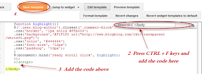
</body>
Screenshot:
blogger comments, blogger tricks

Step 3. Just above it, paste the following code:
<script src='http://code.jquery.com/jquery-latest.js'/>
<script>
$(function() {
function highlight(){
$('.user.blog-author').closest('.comment-block')
.css('border', '1px solid #FFA500')
.css('background','#F1F1F2 url("http://www.blogblog.com/1kt/transparent/white80.png")')
.css('color', '#444444')
.css('font-size', '12px')
.css('padding', '10px');
}
$(document).bind('ready scroll click', highlight);
});
</script>

Customizing the Author Comments:


Border:
The line marked in orange represents the border's style.
What it can be done:
  • 1px - you can increase the value to change the border's thickness
  • solid - change the border's style to dotted, dashed, inset, outset etc.
  • #FFA500 - this is the border's color value, change it with your own color
Background:
The line marked in blue represents the background's style. You can use a plain color or an image. By default there's a combination of both (a white transparent image with a gray plain color).
To change/add:
  • a different color: replace the #F1F1F2 value with your own (use this tool to find the hex code of your desired color)
  • an image: replace the defaul url http://www.blogblog.com/1kt/transparent/white80.png with that of your image

Font Color:
To change the font's color, replace the #444444 color value in green with your own. (you can use this tool to find the hex code of your desired color)

Font Size:
Modify the value in red by increasing/decreasing the "12" value in order to change the size of text.

Step 4. Now Save your Template.

To customize the entire style of threaded comments, please check my previous tutorial on How to Customize Comment's Background, Font Color and Border in Blogger.
Share:
Read More
, ,

How to Customize Blogger Comments By Adding a Background Color and Border

The comments are an essential part of any blog as in them readers express their opinions about a post or a blog, thus it is important to spend a little of our time to make this part looking more stylish, accessible and neat.

To put our comments in order, we should make each comment easy to identify, so that we'll know from where it begins and to where it ends, otherwise it becomes a jumble of letters and our visitors could run away. Here are some methods to make some order by separating each comment.

- Add a Separator To Blogger Comments
- Add a Divider Below Comments in Blogger
- Fully Customize Your Blogger Comments By Changing The Background Color and Border

The first method is the easiest: we'll separate our comments by adding a border below each of them.

How to Add a Separator/Border To Blogger Comments


customize comments, blogger

Step 1. To add a simple separator go to Template > Edit HTML and click on the small arrow on the left of <b:skin>...</b:skin>
Step 2. Click anywhere inside the code area and search using CTRL + F keys, for the following piece of code:
]]></b:skin>

Step 3. Paste the following style just above it:

- If we are using threaded comments (with the reply option):

.comment-block {
border-bottom: 1px solid #000000;
}
.comments .continue {
  border-top: 0px solid #000;
}

- If we are using previous commenting system (with no reply option)
#comments-block .comment-footer {
border-bottom:1px solid #000000;
}

Note: To change the border's color, replace the bolded color value and to change its thickness, increase/decrease the 1 value.

Step 4. Save the Template.

Instead of a simple border, we can also add a divider/image between our comments.

How to Add a Divider (Image) Between Each Comment in Blogger


blogger comments, blogger tricks, blogger tutorials

Step 1. Go to Template > Edit HTML and search (CTRL + F) for the following piece of code:
]]></b:skin>
Screenshot:


Step 2. Paste the following just above it:

- If we are using threaded comments (with the reply option):
.comment-block {
background-image:url(https://blogger.googleusercontent.com/img/b/R29vZ2xl/AVvXsEh_nz90_jW8J-s7QanVYlm8TBkQLDGGioNUfzmxf_PQ0uvmN1K68jEQACixhtP55KjTgej_GqmhNkinDOf-BwvXNy7SOmyLfPhcrZzjM4rO-Qe90KhH9rgngg6Kf6hO9dQivIwgJ4uLwy1o/s1600/74.gif);
background-repeat:no-repeat;
background-position:center bottom;
padding-bottom:30px;
margin-top: -10px;
}
.comments .continue {
border-top: 0px solid #000;
}

- If we are using previous commenting system (with no reply function)
#comments-block .comment-footer {
background-image:url(https://blogger.googleusercontent.com/img/b/R29vZ2xl/AVvXsEh_nz90_jW8J-s7QanVYlm8TBkQLDGGioNUfzmxf_PQ0uvmN1K68jEQACixhtP55KjTgej_GqmhNkinDOf-BwvXNy7SOmyLfPhcrZzjM4rO-Qe90KhH9rgngg6Kf6hO9dQivIwgJ4uLwy1o/s1600/74.gif);
background-repeat:no-repeat;
background-position:center bottom;
height: 50px;
}

Note: The URL that is in blue represents the image that you can change as you like, just remember that at the height must set the height of an image with 30px more, for instance, if the image's height is 50px then the value will be 80px. This is for making sure that the image won't overlap the date of comments. (for threaded comments, increase/decrease the padding 30 value)

Step 3. Save the Template.

But you can still have more styles for each comment, for example adding a background color and a border.

How to Add A Border and A Background Color To Blogger Comments


blogger tips, blogger tricks, gadgets
Step 1. Go to Template > Edit HTML and search for the following piece of code:
]]></b:skin>

Step 2. Paste the following just above it:

- If we are using threaded comments (with the reply option):
.comment-block {
background:#F9F9F9; /* Background Color */
border: 1px solid #f1f1f1; /* Border style */
margin-bottom:20px;
-webkit-box-shadow: 0 1px 2px rgba(0, 0, 0, .4);
-moz-box-shadow: 0 1px 2px rgba(0, 0, 0, .4);
box-shadow: 0 1px 2px rgba(0, 0, 0, .4);
-moz-border-radius: 10px;
-webkit-border-radius: 10px;
border-radius: 10px;
}
.comments .comment-thread.inline-thread {
background-color: #FAFAFA; /* Background color behind the replies */
border-left: 4px dotted #E6E6E6; /* Border on the left side of replies */
}
.comment-content {
padding:2px 10px 10px 10px;
color:#444444; /* Font Color in Comments */
}
.datetime a {
font-style:italic;
font-size:9px;
margin-left: 2px;
}
.comments .comments-content .user a{
color:#1982D1; /* Author's name color */
font-size: 12px; /* Author's name size */
padding-left: 10px;
font-weight:bold;
text-decoration:none;
}
.comments .comment .comment-actions a,.comments .comment .continue a{
display:inline-block;
margin:0 0 10px 10px;
padding:0 15px;
color:#B4B4B7;
text-align:center;
text-decoration:none;
background:#F8F8FB;
border:1px solid #C2C2C5;
border-radius:4px;
height:20px;
line-height:20px;
font-weight:normal;
cursor:pointer;
}
.comments .continue {
border-top: 0px solid #000;
}
.comments .comments-content .icon.blog-author {
background-image: none;
margin-left: -10px;
}
.comments .avatar-image-container{
margin: 0px 0px 0px 0px;
padding: 0px 0px 0px 0px;
width: 40px;
max-height: 40px;
border: 1px solid #F2F2F2;
padding: 1px;
}
.comments .avatar-image-container img{
margin: 0px 0px 0px 0px;
padding: 0px 0px 0px 0px;
max-width: 40px;
height: 40px;
}
Step 3. Save the Template.

- If we are using previous commenting system (with no reply function):

Step 1. Search for this line in your template:
<b:loop values='data:post.comments' var='comment'>
Step 2. Then, add the following code just below of it:
<div class='comments-new'>
Step 3. Look a little further down and you'll see the </b:loop> code and just above it, add this:
</div>
Step 4. Now find this:
]]></b:skin>
Step 5. And just above of it, add this CSS code:
.comments-new{
background:#F9F9F9; /* Background Color */
border: 1px solid #f1f1f1; /* Bprder Style */
margin-bottom:20px;
-webkit-box-shadow: 0 1px 2px rgba(0, 0, 0, .4);
-moz-box-shadow: 0 1px 2px rgba(0, 0, 0, .4);
box-shadow: 0 1px 2px rgba(0, 0, 0, .4);
-moz-border-radius: 10px;
-webkit-border-radius: 10px;
border-radius: 10px;
}
.comment-body {
color:#444444; /* Font Color in Comments */
padding:10px;
}
.comments-new a {
padding-left: 5px; /* Link color */
color: #4A9BD8;
}
.comment-timestamp a {
font-style:italic;
font-size:9px;
padding-right:10px;
padding-left:10px;
}
.comments .avatar-image-container {
overflow: visible;
}
(The rounded edges will not work in Internet Explorer with CSS)

In either case, you can change the background color, border, etc.. in parts with annotations in green.

Step 6. Save the Template.

If you need more help, leave a comment below.
Share:
Read More
,

How to add go to top and go to bottom buttons Using jQuery in Blogger

The Up and Down buttons can be used to navigate to the top and bottom of the page content, especially when on the main page are many articles or when an article has too many comments. These buttons have a fadeIn and fadeOut effect, this means that they will fade slightly when we are scrolling to the top or bottom of the page and additionally, have the function of going up/down the blog.
blogger widgets, blogger navigation
Demo

You can see a live demo on my blog, the buttons are located on the right side.

How to put Go Up and Go Down buttons using the jQuery slide effect

Step 1. Go to Template, click on the Edit HTML button


Step 2. Click anywhere inside the code area and press the CTRL + F keys to open the Blogger search box

Step 3. Copy and paste the following piece of code inside the search box in order to find it:
]]></b:skin>
Step 4. Just above ]]></b:skin> paste this one:
/* Up and Down Buttons with jQuery
----------------------------------------------- */
.button_up{
padding:7px; /* Distance between the border and the icon */
background-color:white;
border:1px solid #CCC; /* Border Color */
position:fixed;
background: white url(https://blogger.googleusercontent.com/img/b/R29vZ2xl/AVvXsEjDln1G7HK4t2O6raX6iIZLUaZZLjHXuafdGXWIxSvDQKvTkcuOMiQ5LEk-64yBVdqWry8F0vHRx2DvC__pVWBgSIa8QIXC4d8WbfJmjmyG2kujtuyNLqw4WCISDutvoUF1X20dSzVopwQ/s16/arrow_up.png) no-repeat top left;
background-position:50% 50%;
width:20px; /* Button's width */
height:20px; /* Button's height */
bottom:280px; /* Distance from the bottom */
right:5px; /* Change right to left if you want the buttons on the left */
white-space:nowrap;
cursor: pointer;
border-radius: 3px 3px 3px 3px;
opacity:0.7;
filter:progid:DXImageTransform.Microsoft.Alpha(opacity=70);
}
.button_down{
padding:7px; /* Distance between the border and the icon */
background-color:white;
border:1px solid #CCC; /* Border Color */
position:fixed;
background: white url(https://blogger.googleusercontent.com/img/b/R29vZ2xl/AVvXsEg73k5pAu4Y9RY3TuKfqUrZNS4FRCm2mUy1F82pjm9zRopDZLPlz8UT_rQCbJlPsinbHraBrjajMpkj1rP9pE-SO8-2HdU_2rfl9W6edIYyZilJf7dziSGkYXxUxVYYplcecxhDyJ6p4EU/s16/arrow_down.png) no-repeat top left;
background-position:50% 50%;
width:20px; /* Button's width */
height:20px; /* Button's height */
bottom:242px; /* Distance from the bottom */
right:5px; /* Change right to left if you want the buttons on the left */
white-space:nowrap;
cursor: pointer;
border-radius: 3px 3px 3px 3px;
opacity:0.7;
filter:progid:DXImageTransform.Microsoft.Alpha(opacity=70);
}
Note:  - in green are some annotations that explains what styles you can modify on their left side.
           - You can change the arrows by changing the URLs in blue.
           - To change the buttons background color of buttons, change the white text with your color

Step 5. Now search (CTRL + F) for the following tag:
</body>
Step 6. And just above it, paste the code below:
<script src='http://ajax.googleapis.com/ajax/libs/jquery/1.7.1/jquery.min.js' type='text/javascript'/>

<div class='button_up' id='button_up' style='display:none;'/>
<div class='button_down' id='button_down' style='display:none;'/>

<script>
//<![CDATA[
(function(){var special=jQuery.event.special,uid1='D'+(+new Date()),uid2='D'+(+new Date()+1);special.scrollstart={setup:function(){var timer,handler=function(evt){var _self=this,_args=arguments;if(timer){clearTimeout(timer)}else{evt.type='scrollstart';jQuery.event.handle.apply(_self,_args)}timer=setTimeout(function(){timer=null},special.scrollstop.latency)};jQuery(this).bind('scroll',handler).data(uid1,handler)},teardown:function(){jQuery(this).unbind('scroll',jQuery(this).data(uid1))}};special.scrollstop={latency:300,setup:function(){var timer,handler=function(evt){var _self=this,_args=arguments;if(timer){clearTimeout(timer)}timer=setTimeout(function(){timer=null;evt.type='scrollstop';jQuery.event.handle.apply(_self,_args)},special.scrollstop.latency)};jQuery(this).bind('scroll',handler).data(uid2,handler)},teardown:function(){jQuery(this).unbind('scroll',jQuery(this).data(uid2))}}})();

$(function() {
var $elem = $('body');
$('#button_up').fadeIn('slow');
$('#button_down').fadeIn('slow');
$(window).bind('scrollstart', function(){
$('#button_up,#button_down').stop().animate({'opacity':'0.2'});
});
$(window).bind('scrollstop', function(){
$('#button_up,#button_down').stop().animate({'opacity':'1'});
});
$('#button_down').click(
function (e) {
$('html, body').animate({scrollTop: $elem.height()}, 800);
} );
$('#button_up').click(
function (e) {
$('html, body').animate({scrollTop: '0px'}, 800);
} );});
//]]>
</script>

Note: In case you want to remove the "Go to top" button, remove the 1st bolded code and to remove the "Go to bottom" button, remove the 2nd one.

Step 7. Finally, Save your changes by clicking on the Save template button. Enjoy!
Share:
Read More
,

How to Add a Vintage Style to Images In Blogger using CSS

To get that vintage Instagram effect on your pictures, you don't have to use a program, now you can use CSS and get a similar result! The following trick will apply a shadow inside the image, add a back border, and on top of the image, add another semitransparent image with a grunge style that will give a vintage touch.

You can see a demo on the test blog - move the cursor over the image and it changes back to normal (notice that borders remain the same):


Obviously, there will be images that will fit better these effects than others, but regardless of that we do, there should be made a few observations:
- this effect is made with CSS and it will not recognize some browsers, especially Internet Explorer. So this effect might not work on older versions of IE. 
- the images are not centered, you will have to align them to the left (default) or to the right.

Now let's add the CSS code for applying this vintage Instagram effect on our images.

Adding Instagram-like Vintage Effect to Blogger Images

Step 1. From your Blogger dashboard > go to "Template" > "Edit HTML"


Step 2. Click anywhere inside the code area and press the CTRL + F keys to open Blogger' search box


Step 3. Type or paste the following tag inside the search box:
</head>
Step 4. Just above </head> add the following CSS style:
<style>
.vintage img {
padding:0;
float:left;
}
.vintage {
border:10px solid #000;
position: relative;
float: left; /* Change to right if you want the images to be aligned to the right */
margin-right: 20px;
margin-bottom: 20px;
}
.vintage:before {
content: "";
display: block;
position: absolute;
top: 0;
bottom: 0;
left: 0;
right: 0;
background-color: rgba(255,102,0, 0.6); /* sepia */
background-image:url(https://blogger.googleusercontent.com/img/b/R29vZ2xl/AVvXsEjUUDRO2rEvINXFCQn0YSA5oSz74hsfPEnR91bSaZdJLf9PPmTfyjLam15Nfl3MWXnyHZoDq-m93n6YhSYpTmcmQ2FbxAFJY3fUPJKRg0AliGJe6B7E32UsuqvmDleUnObqfdyA9MxvK5E/s0/grunge.png);
background-size: cover;
box-shadow: inset 0 0 50px #000, inset 0 0 50px #000, inset 0 0 50px #000;
-moz-transition: all 1s;
-webkit-transition: all 1s;
-o-transition: all 1s;
transition: all .1s;
}
.vintage:hover:before {
background: none;
box-shadow:none;
-moz-transition: all 1s;
-webkit-transition: all 1s;
-o-transition: all 1s;
transition: all .1s;
}
</style>
Note: The line in bold that corresponds to the color of the image, can be changed to any other color; here are some examples of traditional vintage:
background-color: rgba(0,0,255, 0.5); /* blue */
background-color: rgba(0,255,0, 0.5); /* green */
background-color: rgba(0,255,255, 0.5); /* cyan */
background-color: rgba(255,0,0, 0.5); /* red */
background-color: rgba(255,0,240, 0.5); /* violet */
If you want the image not to change to its original state on mouse hover, then remove the last code:
.vintage:hover:before {
background: none;
box-shadow:none;
-moz-transition: all 1s;
-webkit-transition: all 1s;
-o-transition: all 1s;
transition: all .1s;
}
Step 5. Click the "Save Template" button to save the style.

Step 6. Finally, add the following HTML code inside the HTML section of your posts each time you want to apply the vintage effect to an image:
<div class="vintage" style="clear:both;">
<img border="0" src="URL of the image" />
</div>
Replace the text in blue with the url of your picture.

And that's it, with this little experiment you can have your vintage-style images using CSS only.
Share:
Read More
,

How to secure access to gmail account?

Have you ever wondered how to secure access to gmail account? If not, you should! Think for a minute about what the search for following keywords in your mailbox would return: "sick" "problem" "secret" "pwd" "password" "don't tell" "don't repeat"...

I think I have convinced you, so let's seek for solutions to secure the access to gmail:
  1. You should of course use a strong password
  2. In addition, google supports 2-factor authentication. This methods uses your phone + your password to authenticate you. The setup of this method is very simple, just follow the instructions on the link below: http://support.google.com/accounts/bin/answer.py?hl=en&answer=180744   If you have an android phone I advise you to install "google authenticator" application too, to have access to your emails even when you do not have a cell coverage.

Share:
Read More
, ,

How to manage contacts in android / google / gmail ?


How often do you tidy your contact list? Do you know how to manage your contacts in android / google / gmail ?

Your contacts represent your social graph, that is, the links that tie you to your friends and family. This information is invaluable for intelligence agencies and for advertising. Here is the link to the contact management interface in gmail:

https://mail.google.com/mail/u/0/#contacts 

If you are concerned about your privacy, I advise you to
  1. Regularly remove contacts that you do not need and 
  2. Cleanup your mailbox to delete all emails older than 2 years. To do that, see the related post: how to delete all old emails in gmail.

    Share:
    Read More